Chart management
Centreon can be used to generate graphs from monitoring information. There are two types of graph:
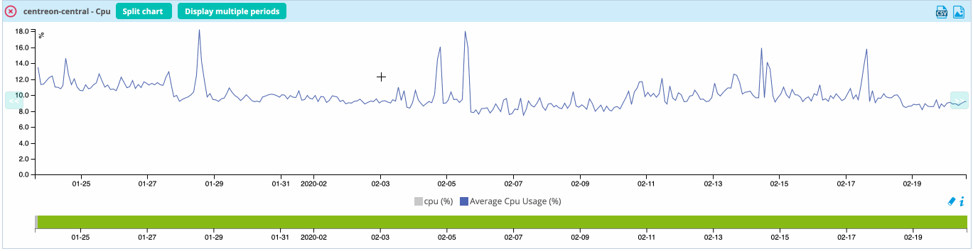
- Performance graphs serve to view the evolution of services intuitively. Example: filling level of a hard disk, network traffic, etc.
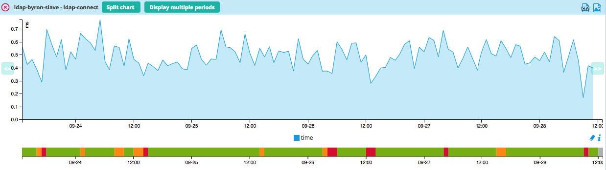
- History graphs (or status graphs) are used to view the evolution of the statuses of a service.
Performance graphs always have a time period for the x-axis and a unit as the y-axis (volts, bytes, etc.). History graphs always have a time period for the x-axis, and their y-axes do not vary. Only the color of the graph can be used to view the status of the object:
- Green for OK status
- Orange for WARNING status
- Red for CRITICAL status
- Gray for UNKNOWN status
Example of performance graph:
Performance graphs
There are several ways to view performance graphs:
- Viewing the graph in the list of services, from Monitoring > Status Details > Services menu, by mouseover on the
icon

- Viewing the graphs from the host' detail page by clicking View graphs for host
- Viewing the graph from the service details page
- From the Monitoring > Performances > Graphs menu to view multiple graphs
Status graphs
In the same way as for the performance graphs, there are several ways of accessing status history graphs:
- From the service' details page
- From the Monitoring > Performances > Graphs menu, by first selecting a specific service.
Viewing multiple graphs
To view all graphs, go to the Monitoring > Performances > Graphs menu.
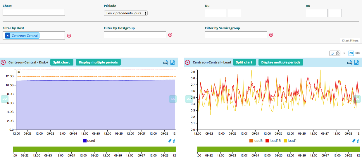
This page offers several selection options as well as filtering options:
- The Chart option lets you select the chart you want to display
- The Period option lets you select a predefined the time window to display the data
- The From and To fields let you select a manual time window to display the data
- The Filter by Host option lets you filter the Chart list by presenting only the graphics linked to the selected resources
- The Filter by Hostgroup option lets you filter the Chart list by presenting only the graphics linked to the selected resources
- The Filter by Servicegroup option lets you filter the Chart list by presenting only the graphics linked to the selected resources
Several actions are possible on the page:
- To refresh the data manually by clicking the icon

- To automatically refresh the data by clicking the icon
 and by selecting a
predefined period
and by selecting a
predefined period - To display charts on 1, 2 or 3 columns by clicking the associated icon

Several actions are possible on each graph:
- Split chart: separates multiple curves of a graph into multiple graphs, each containing one curve
- Display multiple periods: displays the graph over a period of 1 day, 1 week, 1 month, 1 year
- To export the graph in a CSV format by clicking the icon
 or in PNG by clicking the
icon
or in PNG by clicking the
icon 
- To move forward in time by clicking the icon
 or backward by clicking the
icon
or backward by clicking the
icon 
- It is also possible to zoom in on a time period by clicking the graph and then selecting a time window: